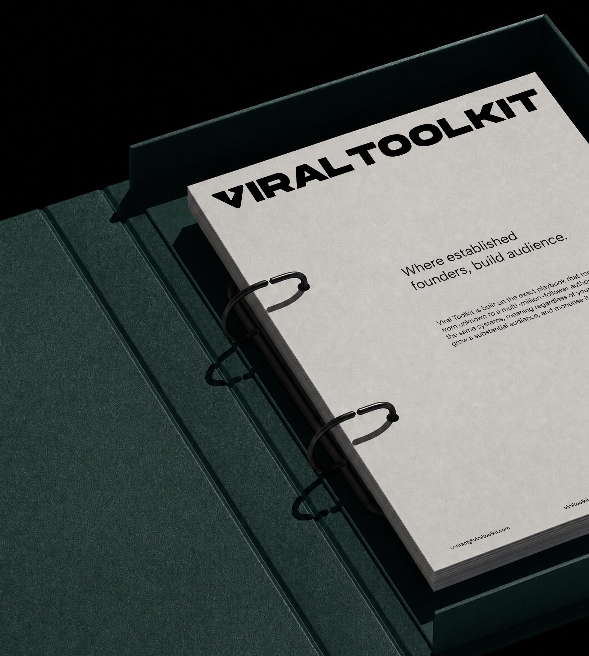
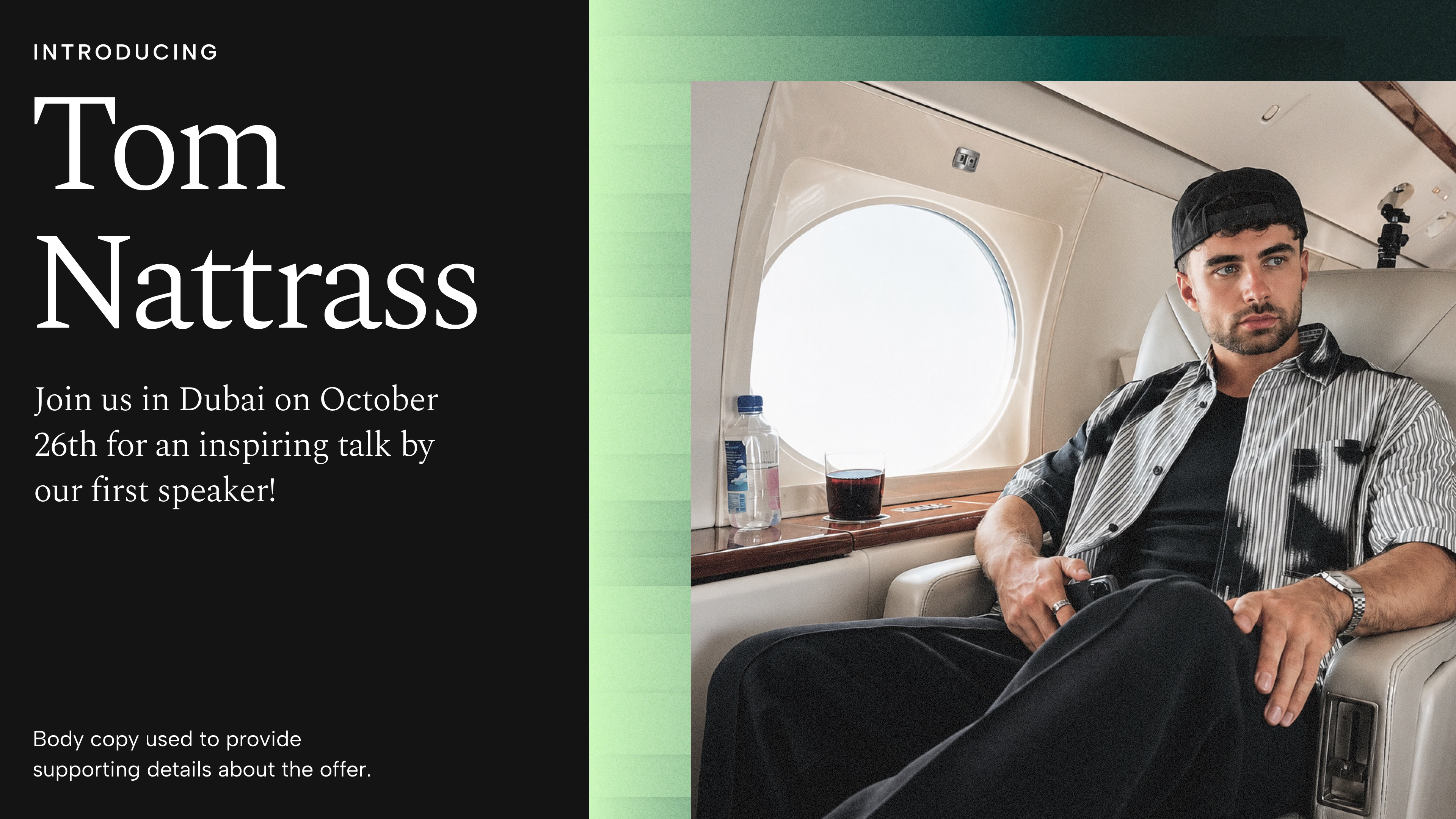
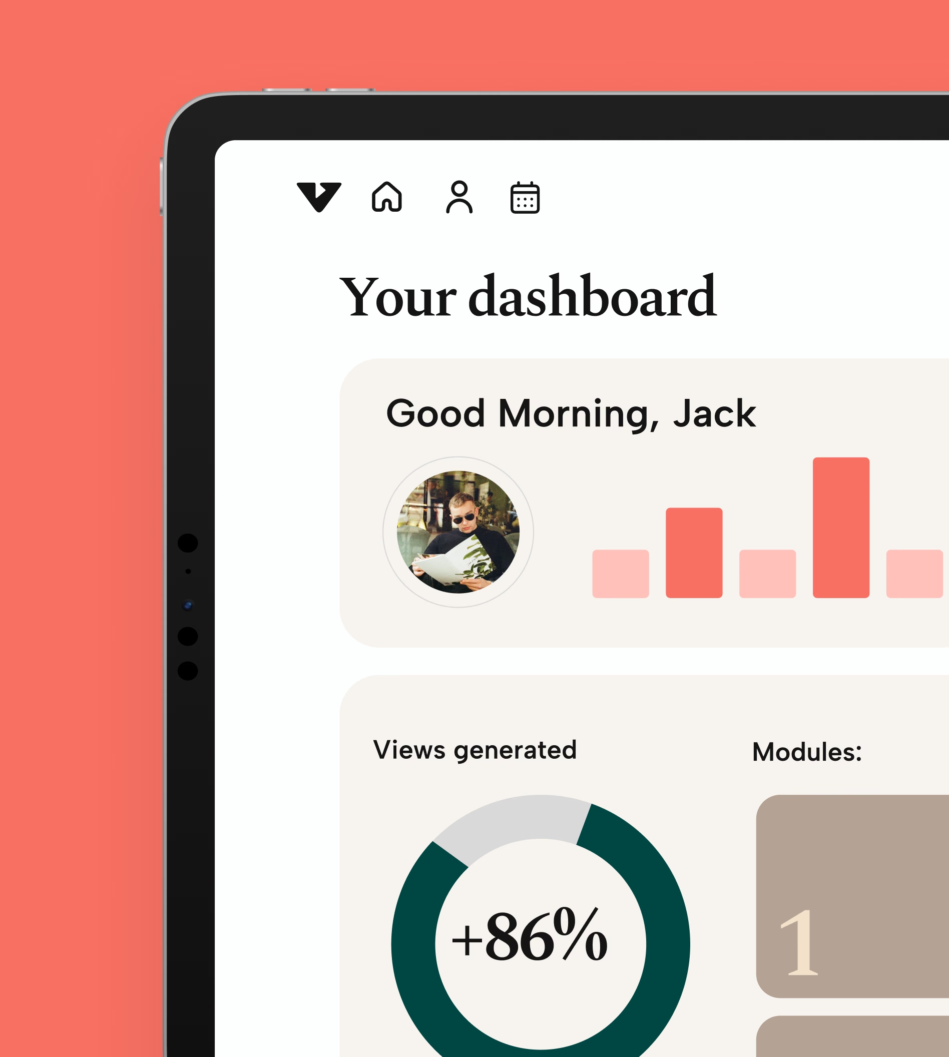
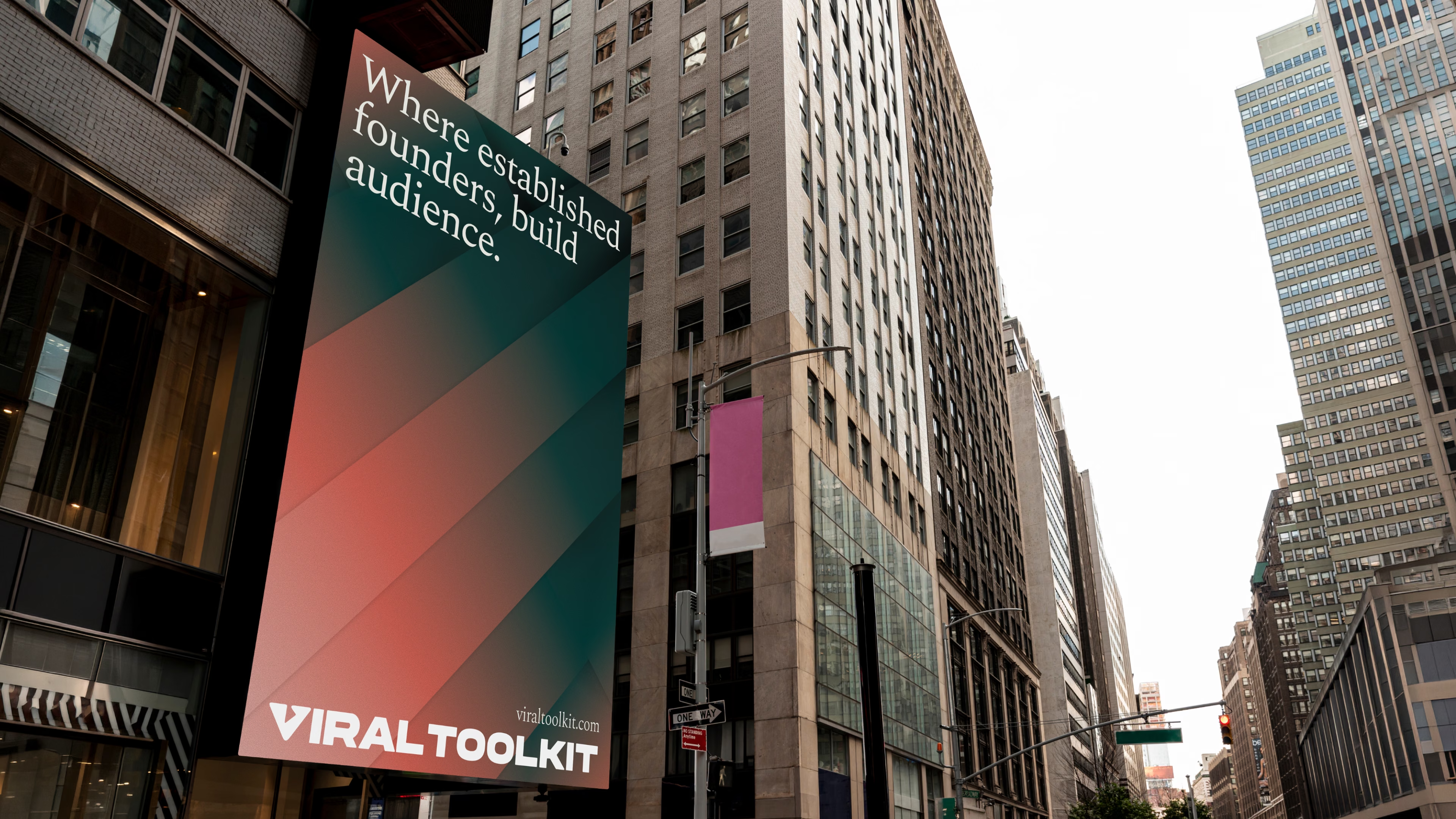
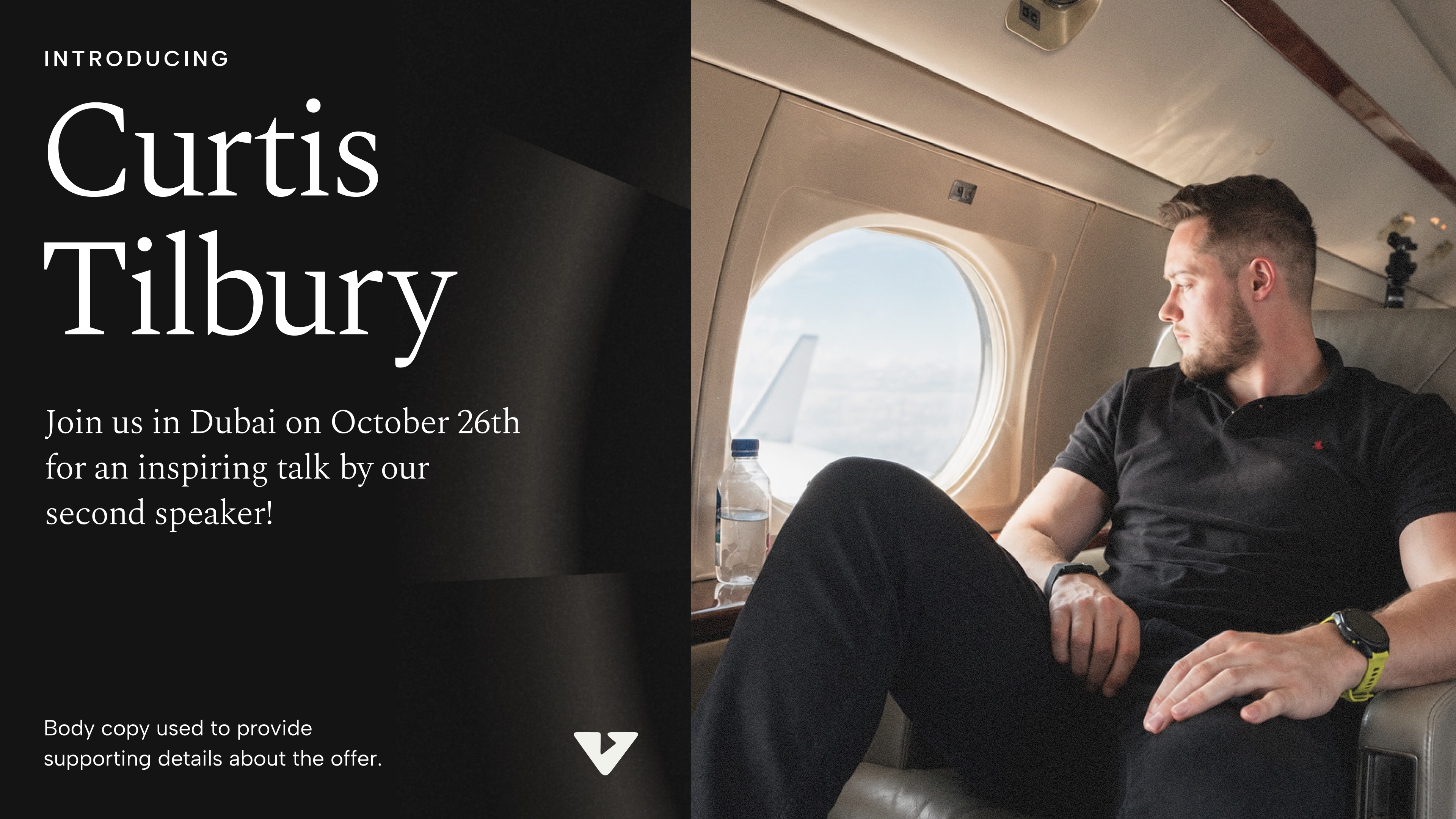
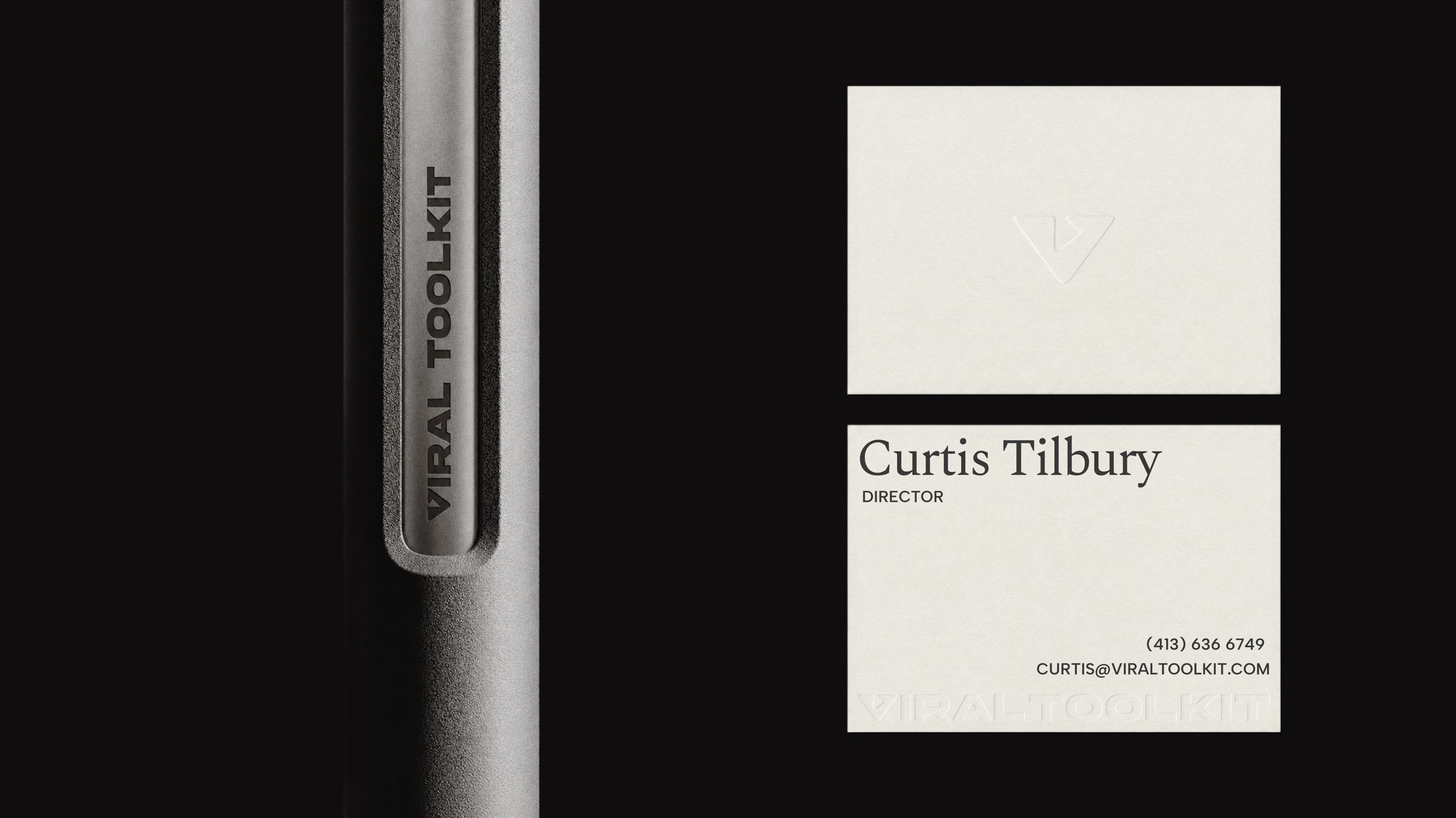
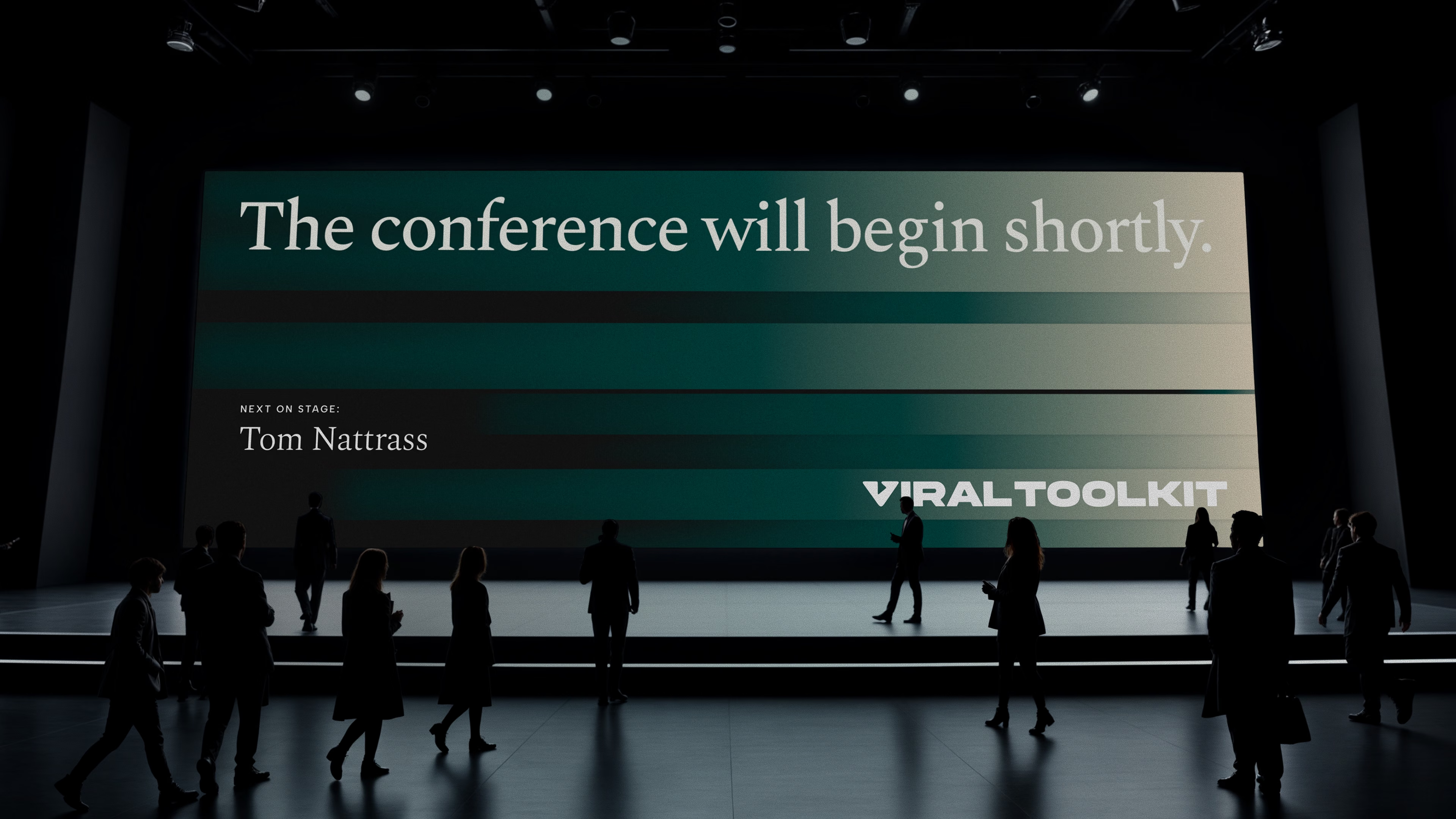
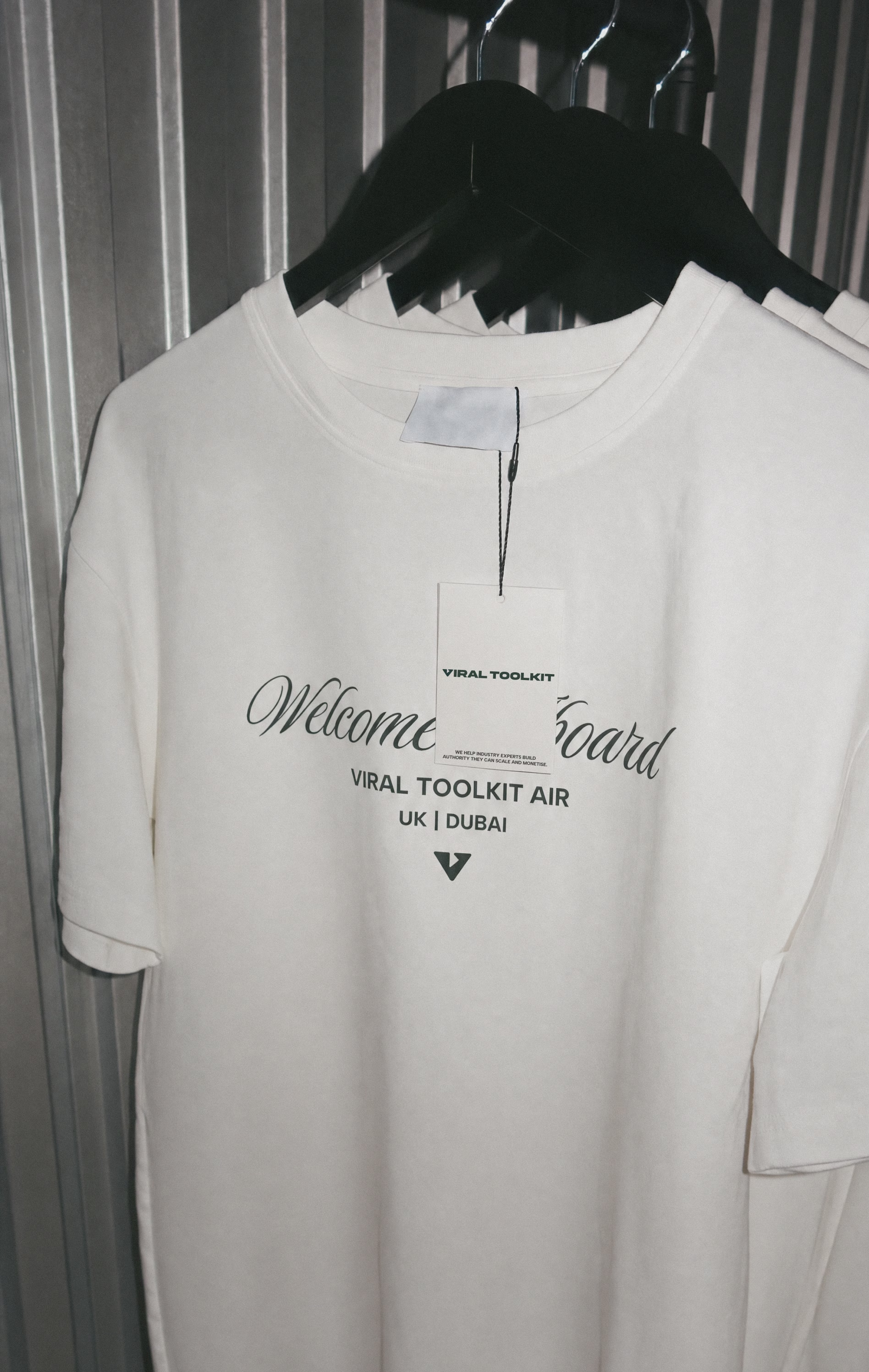
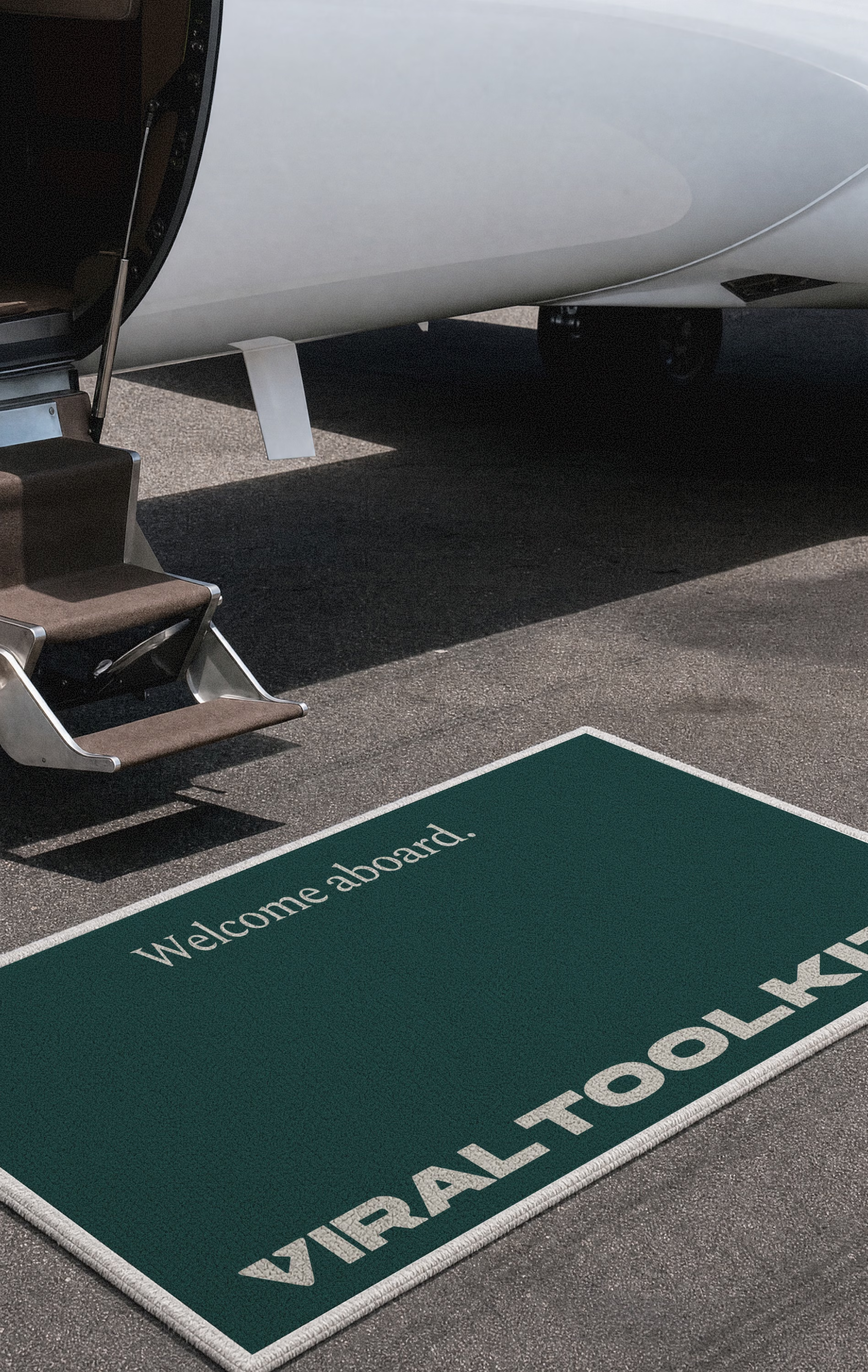
Our visual analysis showed every competitor crowded into the same colours and the same clean sans serif type, which left two ownable positions on the table: a dark green that reads proven, wealthy and premium, and a serif led voice no other coach was using. Both were locked before a single screen was designed.